Preface
Before reading this blogpost you should probably take a look at the COVID Dashboard Germany created by the german Robert Koch Institut (RKI). It provides all necessary numbers and informations over the current and historical situation of the COVID-19 pandemic in germany.
All data is also available in an open COVID 19 datahub.
What is my problem with the dashboard?
It's actually really simple:

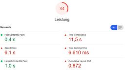
I know that Lighthouse reports aren't silver bullets, but they give a good indication of things and are also more or less reproducible.
As you can see, the dashboard loads massive amounts of data in many requests and takes over ten seconds to finish loading on my desktop pc with a wired broadband internet connection.
It gets even worse when we look at the desktop performance report. For some reason I even had to run the lighthouse tool about five times before even getting a result. The other times it either kept hanging or failed outright.
So now brace yourself, it's going to hurt:
But why is it so large?
The dashboard does a lot of things and also the components it uses are shared between dashboards and download other dependencies on their own. This leads to a JS payload of 2.1MB spread over 84 requests. This is 10.3MB of uncompressed JavaScript. At that point even the included React library isn't noticeable anymore.
So huge data makes things slow - It's as fast as possible?
Sadly: No.
If you take a closer look at the waterfall, you can see that it's a long linear flow. This is not good. In such a graph you would like to see strong vertical lines, since they mean that things are downloading in parallel. Here the requests trickle in nearly one by one and henceforth the download is spread out over a long time (since the dashboard is using h2, the number of connections is not a limiting factor).

Also downloading 169 request for data to display which result in 13.5MB of uncompressed data isn't exactly fast either.
This all leads to the following experience:
- after about one second the user can see a little loading animation
- after about 2.5 seconds the user sees the app shell with the basic layout of all elements.
- after about two more seconds the first simple data (general 7-day incidence) comes in
- after ten seconds finally the application finishes loading
Can it be faster?
Obviously, since I published this blogpost, I think it can be done faster. But it's easy to spit words, much harder to show something.
Let's set some requirements
For this to be actually a viable solution and possible to implement in the context of this blogposts, I set some limitations and requirements for a solution:
- Use the official data of the RKI Datahub
- Always use the current data - noone likes data that is days old
- Show the user the local, federal and nation wide 7-day incidence and total number of cases
- Show the user the local, federal and nation wide 7-day incidence and total number of deaths
The dataset
To fulfill requirement 1. and 2., we'll use the RKI Corona Landkreise dataset, since it includes data for the local level and allows us to calculate federal and nation wide numbers. Also it's served with the correct CORS headers, so we can fetch it directly from the client (Yay, Jamstack!).
Since we're only interested in the actual numbers and don't need the card data, we're going to use the CSV version of the data, since it's "only" 160KB uncompressed to download. It's still larger than I would've liked, but since it's pretty compressible, we actually only transfer about 50KB over the wire.
Used tooling
I will use LIT to achieve this. That way the resulting component could be embedded anywhere, since it's just a web component.
The result
This is now implemented as a web component and in under 90KB. This small widget shows some of the most important COVID data for germany in a really performant way and is always up-to-date.
Oh did I mention that the 90KB includes the about 50KB of CSV... And this whole blogpost including images? Take a look in the dev tools - the JS bundle for this page, that ships the web component and the LIT dependency is under 10KB.
I will probably expand this post in the future and show some details about the code, but until then you can take a look in my github in the source of this blog: GitHub Link to TS source fot this blogpost
Disclaimer
This post is not about the pandemic situation itself. I'm neither a data scientist nor do I work in the medical sector.
I also want to mention that I highly appreciate the work of the RKI in even providing such a nice view on the data so it is accessible to everyone.
The following blogpost simply shows some thoughts of mine from a web developers point of view. I will implement some alternative visualizations. Those are just a different view and in general are probably not as useful as the one provided in the linked dashboard.