The pain of having big screens...
I will not shame anyone here since it's just an example for a commen issue.
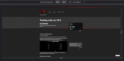
Go to your page now, open dev tools, simulate a device and emulate a screen like 3440x1440p.
... is having to see that many devs clearly don't.
I know, I know. First world problem, rich people problem. But that isn't an excuse for letting your pages break.
The pleasure from using a 21:9 monitor is really great, when you can have an editor and a normal browser open side by side and you can still read the class names from that coworker in you editor.
I daily drive a 21:9 and more often than I'd hope I surf the web and stumble upon things like this:
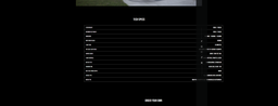
Clearly the designer didn't want the social links to sit on top of the table (it's with a fixed position) and the developers obviously didn't test for it on an ultrawide screen.
Being aware of the problem
Many devs are either not aware that such screens exist, or think that they aren't common at all, but the more I look around, the more people I find who use such a screen.
Also as devs we came to the agreement that designs should work on nearly any screen from a small feature phone up to a desktop or TV. So why would we stop at some aspect ratio?
But we do not have the money to buy such screens...
I tend to call BS on that. My productivity saw an increase close to going from one to two screens by going from two 16:9 to 21:9 + 16:9. It makes a huge difference, especially if you tend to multitask with more than two windows (e.g. editor, browser, second browser with docs).
Now make some napkin math on what you cost as a developer per hour and how long it would take to make a ROI (return on investment) on such a screen. It's probably less than you think.
But our designs don't work on that screen...
And that's generally okay. I know that those screens are not default and I don't expect your site to look as nice as on 16:9 (or even use the additional space for something useful), but it should at least be useable.
So how do I test?
My screenshots are in chrome, but this is possible in all common browsers.
Simple:
- Open Dev Tools
- Click on the Device Toolbar / Device Emulator
- Select a custom resolution (e.g. 3440x1440)
- Profit... Or not.
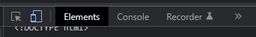
Remeber that button and the following view, it will be one of your new best friends!
And now go out and make the world a better place so that at some point I hopefully don't have to see unuseable websites again.